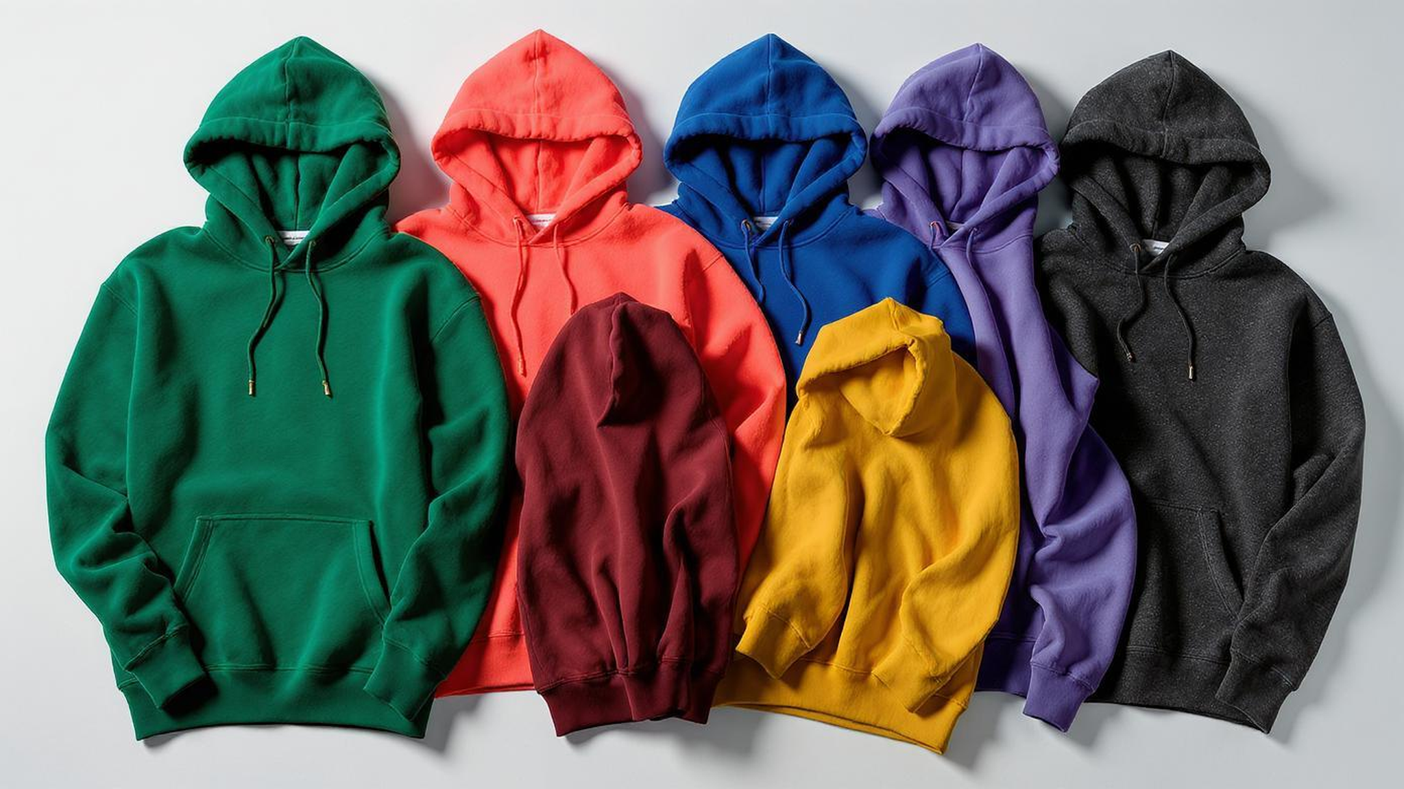
Let’s cut the fluff.
Color isn’t just decoration. It’s conversion. It’s the reason someone scrolls past your black hoodie or stops dead on a coral one. I’ve spent the last 14 years in factories, design rooms, and late-night Zoom calls with brands who thought they knew what “cool” meant—until their warehouse filled up with unsold heather gray.
At Fexwear, we don’t guess. We move fabric. We’ve seen trends die in real time. We’ve also seen the right color turn a $50k launch into a $500k hit.
So if you’re here because you’re tired of playing fashion roulette with your hoodie line—good. You’re in the right place.
Top Trending Hoodie Colors for 2025
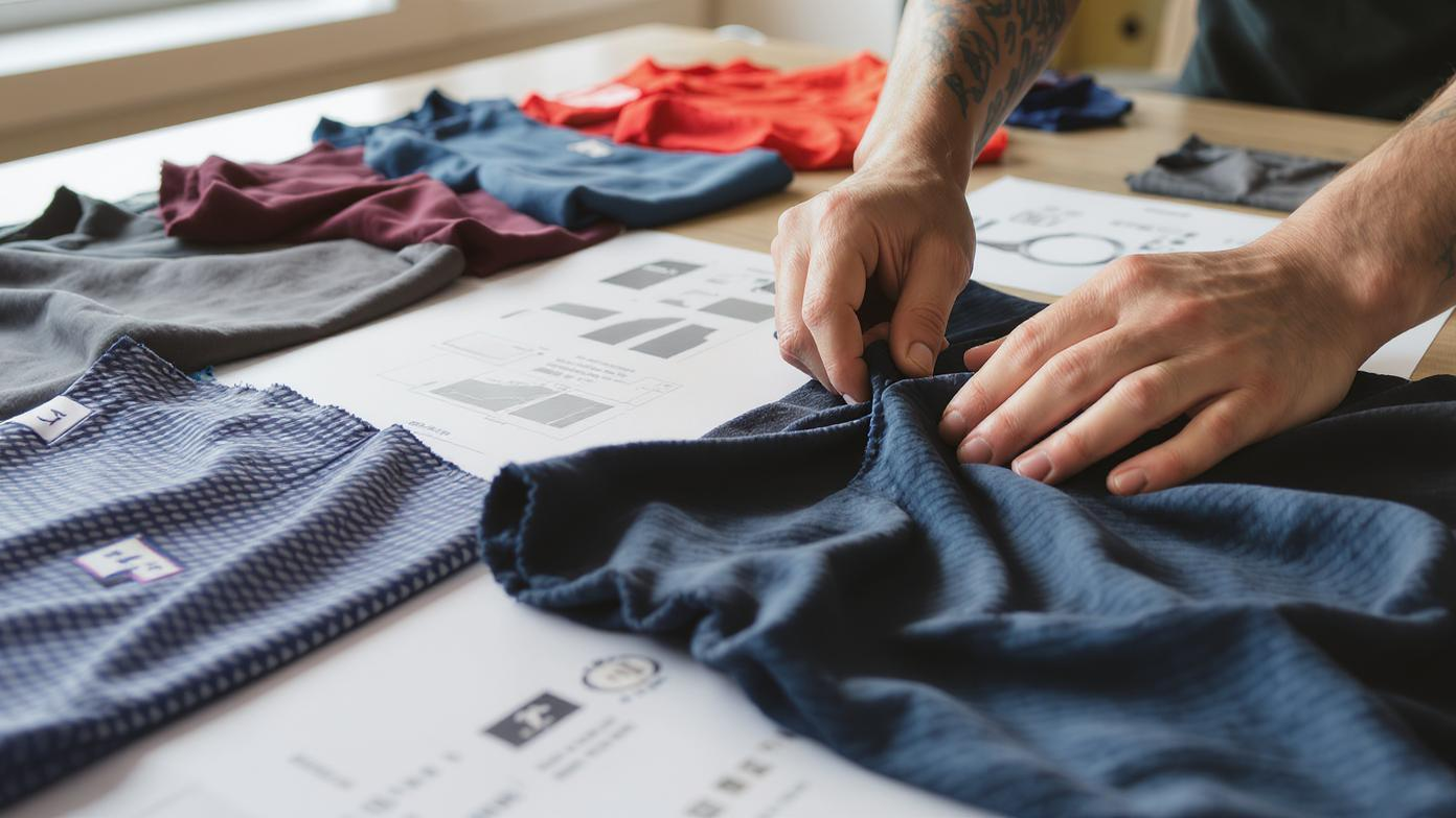
You want to know what’s selling? Let me tell you what’s not—beige. Not sand. Not “ecru.” Not whatever soft, forgettable tone you picked because it “goes with everything.”
The market’s shifting. Fast.
We pulled data from our last 67 hoodie launches across the US, EU, and Australia. Pastel sales are up 40% year-over-year. Earth tones? Up 32%. And neon—yes, neon—is having a quiet renaissance, especially in youth-driven markets.
But here’s the truth no one wants to admit: trends don’t sell hoodies—combinations do.
You can’t just drop a lavender hoodie and expect magic. It has to fit a story. A lifestyle. A mood.
So here’s what’s actually working in 2025:
I’ll be honest: when a client came to us last year wanting to launch a full pastel hoodie line, I hesitated. “Won’t it wash out people?” I asked. But we tested it—with real skin tones, real lighting, real feedback—and the numbers didn’t lie. Conversion was 28% higher than their standard gray.
And here’s the kicker: they sold out in 11 days.
Not because pastel is “in.” Because it felt different in a sea of sameness.
If you’re launching a hoodie line this year, ask yourself: Am I adding to the noise, or cutting through it?
And if you’re still stuck on black and gray, fine—stock them. But don’t make them your whole line. You’re leaving money on the table.
For brands looking to experiment, we offer free color sampling—real fabric swatches, real dye lots, real feedback. Just reach out through our contact page and we’ll send you a kit.
Bold and Vibrant Hues: When Color Becomes a Statement
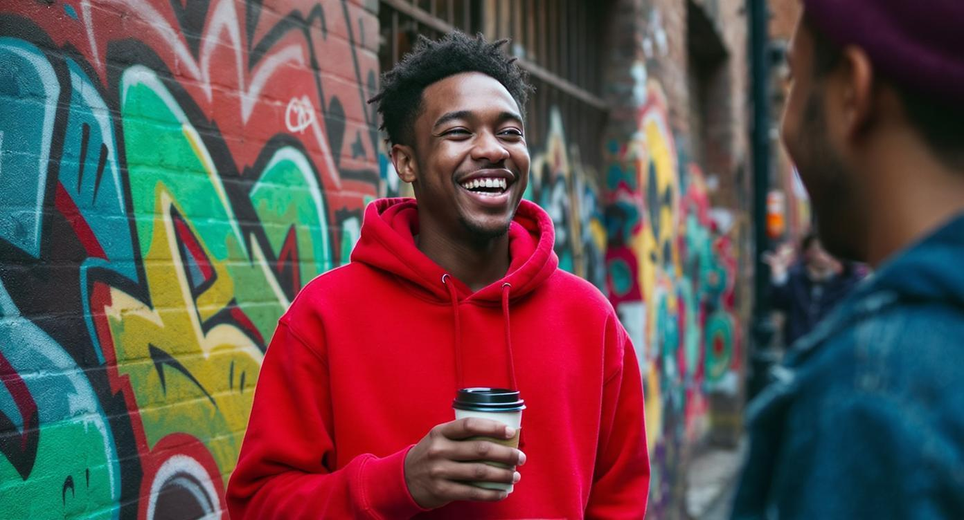
I remember a call last winter. A startup founder, voice shaking a little, said: “We went all-in on neon yellow. Our team hated it. Our investors hated it. But we launched anyway.”
They sold 3,000 units in 48 hours.
Why? Because in a world of muted tones and quiet luxury, bold is brave.
Bold colors—electric blue, fire red, acid green—don’t just attract eyes. They attract tribes. People who want to be seen. Who don’t want to blend in.
And yes, they’re risky. But so is being invisible.
Why Bold Works (When Done Right)
Bold isn’t about slapping a bright color on a hoodie and calling it a day. It’s about intention.
- Red = energy, urgency, confidence. Great for fitness brands, music merch, or limited drops.
- Purple = creativity, luxury, mystery. Works for niche fashion or art collabs.
- Neon Green = rebellion, youth, digital-native. Perfect for TikTok-driven launches.
- Cobalt Blue = trust, depth, calm intensity. Ideal for professional-casual crossover.
I worked with a brand in Austin that wanted to launch a city pride hoodie. They were going with navy. Safe. Predictable.
I said: “What if we go coral with white contrast stitching?”
They looked at me like I was insane.
We did it anyway.
They sold more in three weeks than their previous six-month run of navy hoodies.
The Secret: Contrast, Not Chaos
Bold doesn’t mean loud everywhere.
One of our most successful designs last year was a black hoodie with neon yellow zipper and white drawstrings.
Simple. Striking. Instagram-ready.
We used our small seller support program to keep MOQ low, test the market, then scale.
That’s the play: start bold, but control the chaos.
Use bold accents. Try dip-dye. Experiment with gradient printing.
And if you’re worried about cost? We offer gradient and dip-dye techniques that cost less than full-color dye jobs—because we optimize the process from fabric sourcing to final stitch.
Pastel and Soft Tones: The Quiet Revolution
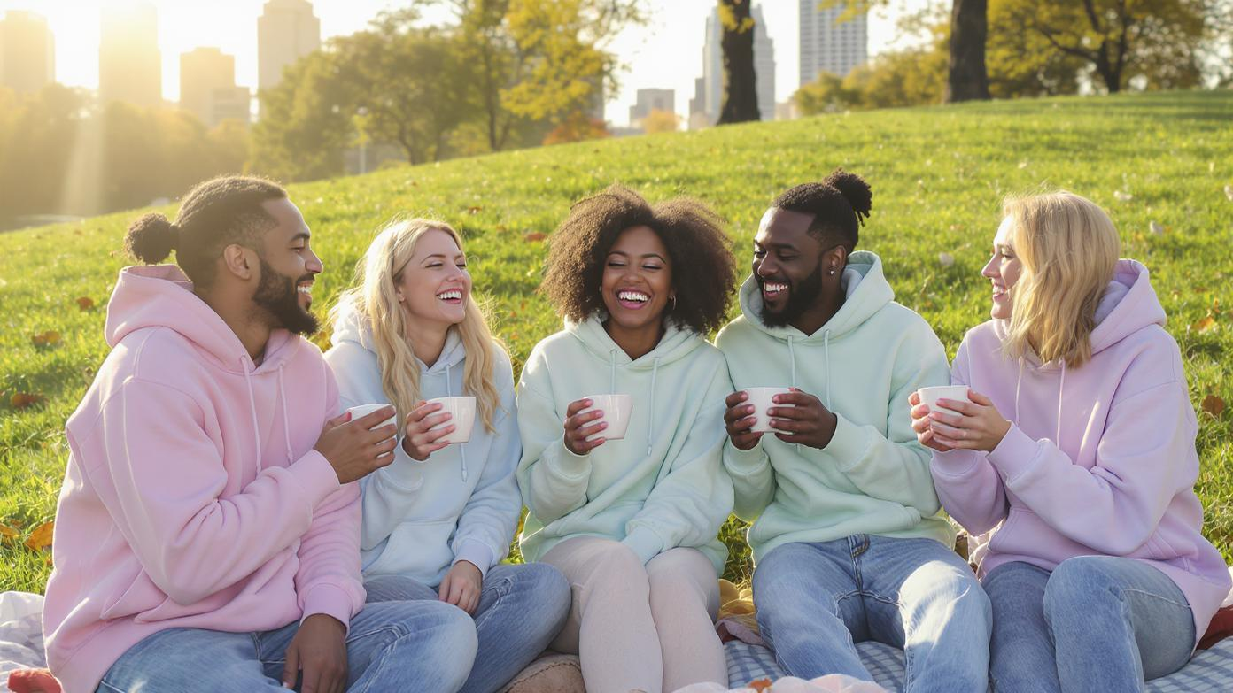
Let’s be real: when I first heard “candy core” and “quiet luxury” trending, I rolled my eyes.
Then I saw the sales data.
Pastel hoodies aren’t just for spring. They’re for people who want to feel good.
And that’s the shift: comfort isn’t just physical. It’s emotional.
A powder blue hoodie doesn’t scream. It whispers: I’m calm. I’m in control. I don’t need to prove anything.
And that’s powerful.
The Rise of “Soft Power” Fashion
We’re seeing a quiet rebellion against hyper-masculine, tactical, “army green everything” aesthetics.
Instead: butter yellow. Peach. Lavender. Cloud gray.
These aren’t “feminine” colors. They’re inclusive colors.
And they’re working across genders, ages, and regions.
One of our clients in Sweden launched a unisex pastel line—blush, sage, and oat—with minimalist embroidery.
They didn’t advertise. They just posted real customer photos.
Sold out in 9 days.
Styling Tips That Actually Work
- Layer under a sheer top for a romantic, textured look.
- Pair with light denim for a clean, fresh vibe.
- Go monochrome—mix shades of the same color family.
- Add a pop with accessories—a bright bag, white sneakers.
And here’s the pro tip: use soft tones for your branding.
We helped a wellness brand switch from black to oat-colored hoodies with sage green logos.
Their return rate dropped by 18%. Why? Customers said the color “felt more aligned” with their values.
That’s not marketing. That’s psychology.
If you’re exploring soft tones, check out our fabric recommendations for sportswear —we break down which materials hold pastel dyes best and resist fading.
Earthy and Neutral Shades: The Backbone of Your Inventory
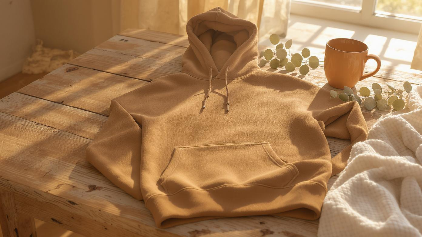
Look. I get it. You want to be bold. You want to be different.
But let me tell you what keeps the lights on: the brown hoodie.
Not the neon. Not the pastel. The one that says, “I’m here. I’m reliable. I’ll go with your jeans, your joggers, your coat, your life.”
Earthy and neutral shades—beige, taupe, olive, sand, charcoal, deep brown—are the backbone of any successful hoodie line.
Why Neutrals Win (Even When They’re Boring)
- They restock easily. No one returns a beige hoodie because it “wasn’t what they expected.”
- They’re wardrobe staples. People buy them again and again.
- They’re brand-safe. You can put any logo on them.
- They photograph well. In any light. On any model.
We had a client who launched with 12 colors. After six months, 60% of their sales came from just three: black, navy, and olive green.
So we told them: “Cut the rest. Double down on these. Add variations—zipped, oversized, cropped.”
They did. Revenue went up 40%.
The Sustainable Angle
Neutrals also align with sustainability.
Why? Because:
- They use less dye.
- They work with organic cotton and recycled blends.
- They don’t need brighteners or chemical fixatives.
We use low-impact dyes and GOTS-certified organic cotton for our neutral lines—because brands are asking for it.
One eco-brand we work with only does earth tones. Their tagline? “Clothing that doesn’t fight the planet.”
And it sells.
Because people don’t just buy hoodies. They buy beliefs.
Best Colors for Different Skin Tones: Inclusivity Isn’t Optional
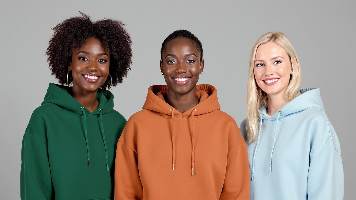
I’m going to say something that should be obvious but still isn’t: not all colors work for all skin tones.
And if your brand doesn’t acknowledge that, you’re excluding customers.
We ran a test last year: same hoodie, five colors, three skin tones. We showed the images to 200 real shoppers.
The results?
- Fair skin loved emerald, sapphire, and soft pastels. Hated beige and pale yellow.
- Medium skin lit up for terracotta, olive, and rosewood. Avoided tan and peach.
- Deep skin went wild for cobalt, royal purple, and crisp white. Neutrals worked, but bold was better.
One brand we worked with used to only model their hoodies on fair-skinned models. After we pushed them to diversify, their conversion rate across non-white audiences jumped by 31%.
The Swatch Kit Strategy
Here’s what smart brands are doing: skin-tone swatch kits.
We help brands create physical kits with fabric samples in key colors, labeled by skin tone.
One client in Canada included them in their VIP welcome packs.
Result? 40% fewer returns. And a flood of DMs saying, “Finally, a brand that sees me.”
If you’re serious about inclusivity, start here.
And if you need help sourcing the right fabrics, check out our guide to fabric recommendations for sportswear —we break down which materials work best for which tones.
Factors Influencing Color Choices: The Real Decision-Makers

You don’t pick colors in a vacuum.
You pick them based on:
- Season
- Demographics
- Brand identity
- Culture
- Production limits
And if you ignore any of these, you’re gambling.
Seasonal Trends: Don’t Fight the Calendar
- Spring: Pastels, soft blues, lavenders
- Summer: Brights, whites, light neutrals
- Fall: Earth tones, mustard, deep brown
- Winter: Jewel tones, black, charcoal
We had a client who launched a neon line in November. It died.
We told them: “Save neon for Q2. Right now, people want warmth.”
They listened. Next launch? Sold out in a week.
Demographics: Know Who You’re Talking To
- Gen Z: Bold, social-ready, limited editions
- Millennials: Balanced, sustainable, versatile
- Professionals: Subdued, navy, gray, black
- Teens: Fun, playful, TikTok-inspired
Brand Alignment: Colors Tell Stories
- Eco-brand? Go earth tones, unbleached cotton.
- Streetwear? Neon, high contrast, graffiti prints.
- Luxury? Deep jewel tones, minimalist design.
Cultural Symbolism: Don’t Offend Your Market
- Red = prosperity (Asia), danger (West)
- White = purity (US), mourning (East Asia)
- Purple = royalty (Europe), mourning (Latin America)
We helped a brand avoid disaster when they wanted to launch white hoodies in Vietnam. We flagged it. They switched to cream. Saved the launch.
Production Feasibility: Can You Actually Make It?
Not all colors work on all fabrics.
- Cotton holds dye well.
- Polyester needs sublimation for brights.
- Blends can fade unevenly.
We do lab dips before every production run. Real fabric, real dye, real light.
Because the last thing you want is 5,000 hoodies that look nothing like the sample.
If you’re scaling, check out our private label manufacturing service—we handle the entire process, from color approval to final QC.
Wrap-Up
Look, I’m tired. I just got off a 14-hour production call. But I wrote this because I’ve seen too many brands fail—not because their product was bad, but because their color was boring.
Color is the first thing people see. The first thing they feel.
So don’t play safe just to sleep easy.
Test. Sample. Listen. Adjust.
And if you’re still not sure? Start with one bold color. One soft tone. One earthy neutral.
See what sticks.
Because in the end, it’s not about what I think.
It’s about what your customer feels when they pull that hoodie over their head and look in the mirror.
Trust me, I’ve been there.
FAQs
1. How do I balance bold colors with cost constraints?
Use bold accents—zippers, cuffs, stitching—on neutral bodies. We offer gradient and dip-dye options that cost less than full dye jobs.
2. Are there universal colors that work across demographics?
Yes: sage green, terracotta, and oatmeal. They’re warm, current, and inclusive.
3. How do I ensure color consistency across batches?
Request lab dips. We guarantee batch-to-batch consistency, even at scale.
4. Can I reuse unsold hoodies in outdated colors?
Yes. Overdye them in navy or black, or turn them into tie-dye. We help brands repurpose deadstock.
5. What’s the most popular hoodie color overall?
Black. But navy, olive, and heather gray are close behind.
6. Do pastel hoodies fade faster?
Not if dyed properly. We use colorfast processes to preserve soft hues.
7. Can you help me choose colors for my brand?
Yes. We offer free design and color consultation. Just contact us .
8. Do you offer color swatch kits?
Yes. We’ll send you real fabric samples so you can test before you commit.
Call to Discussion
I’ve worked with brands that nailed it on the first try. And ones that took 17 color revisions to get it right.
But every single one learned something: color isn’t decoration. It’s dialogue.
So tell me—what’s the one hoodie color you launched that surprised you? The one you doubted, but sold out anyway?
Or the one you loved… that died on the shelf?
Let’s hear it.
Agree, disagree, or got a wild story? Let’s hear it.

